
Free interactive colour tool
Palette & Value Finder
Find colours in a photo, explore light and dark shapes, and download a reference for your easel.
Your image stays on your device. No account, upload to a server or external libraries.
Start here: a simple guide
This tool helps you choose colours and understand the light and dark shapes in a painting. Use a reference photograph before you start, or a photograph of your own painting to check its progress.
Three useful terms
- Value (also called tone) means how light or dark a colour is. A vivid colour can still be dark.
- Greyscale shows your image in shades of grey, making those light and dark relationships easier to see.
- A value study simplifies the greyscale image into a few shades. This makes the main light, middle and dark shapes clearer.
Value is the lightness or darkness you are looking at; greyscale helps you see it; the value study simplifies it.
How to use the tool
- Choose an image. Start with five palette colours and five value bands. These are separate settings: one controls the number of colour swatches; the other controls the number of grey shades in the value study.
- Compare the original with greyscale. Do important shapes still stand out when colour is removed? Two different colours can become almost the same grey.
- Look at the simplified value study. Try three bands to see the biggest light and dark shapes. Five show more variation; nine retain more detail. Use this to help plan your painting—you can change or simplify what you see.
- Choose your colours. “Overall palette” represents the larger colour areas. “Colour variety” helps smaller, distinct colours appear. Pick a missing colour directly from the image, and lock any swatches you want to keep.
- Take it to the easel. Mix small test swatches. Paint the main light, middle and dark areas first, then add detail. Print or download your reference to keep beside you.
If two neighbouring shapes merge in greyscale, making one lighter or darker can help separate them in your painting.
About the percentages: these estimate how much of the analysed image belongs to each colour group. They are not paint-mixing ratios or instructions for how much of each colour to use.
Worked example: Brueghel’s landscape
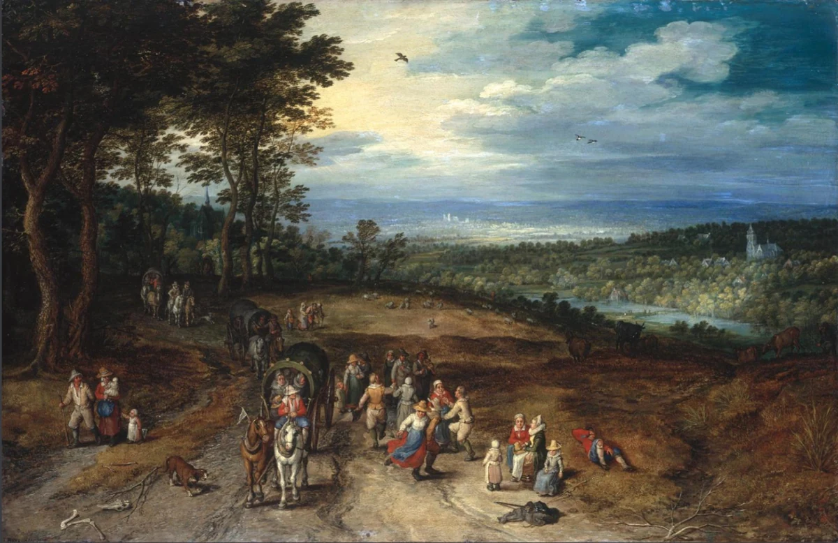
In this supplied reproduction, compare the dark trees on the left with the lighter sky and distant landscape. Notice the red, blue and pale clothing in the foreground. In greyscale, some colour differences become less obvious, while the pale clothing remains distinct from darker surroundings.
Load the example below and compare all three views. Start with three bands to see the broad structure, then five to examine the figures and track. Ask: which shapes remain clear without colour? In your own painting, establish those big tonal relationships before adding small colourful accents.
Jan Brueghel the Elder, Landscape with Travellers and Peasants on a Track, 1610. National Gallery source. This reproduction is an educational reference, not a calibrated colour measurement.
JPEG, PNG or WebP · up to 20 MB and 40 megapixels. Transparent areas are placed on white.
What to look for in the ape study
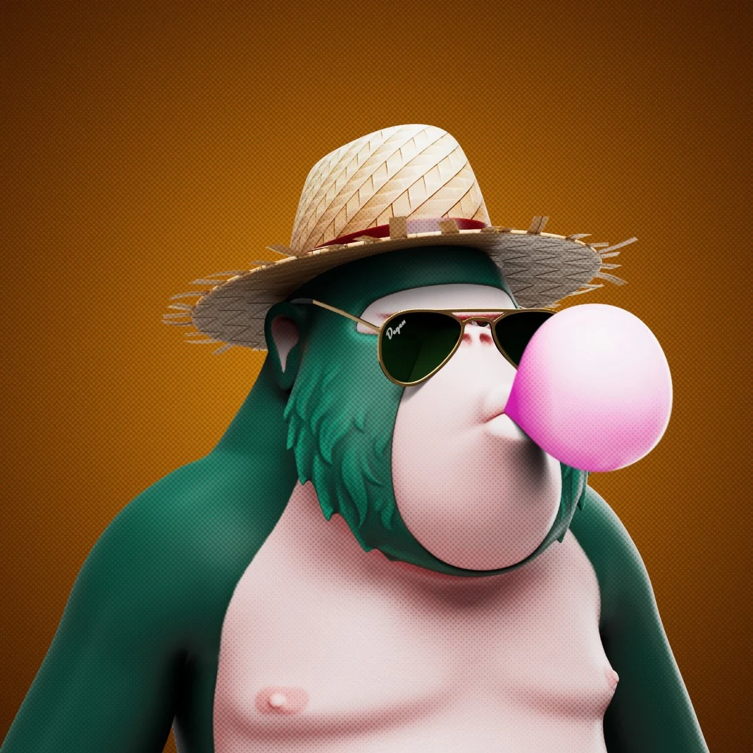
Compare the teal body, orange background and pink bubble in colour and greyscale. Notice how the pale hat and bubble contrast with the dark sunglasses. Try three value bands to see the broad shapes, then five to see more modelling. This sample starts with five palette colours and five value bands.
Choose an image or try the sample to begin.
Extraction changes the swatches only. Value bands change the simplified view only.
Pick: click or tap the original to replace a chosen swatch. Area: drag a rectangle; all three views then show that area.
Your painting palette
See suggested paint combinations for these colours ↓
Select a swatch to replace it with a colour picked from the image, or edit its colour directly. Lock it to keep it when regenerating. Percentages are approximate coverage of the analysed area; picked and edited colours have no percentage.
Display value: 0 = white, 9 = black. These are approximate sRGB display values, not calibrated Munsell measurements.
Suggested paint combinations
CMY suggestions are shown automatically. Change to Traditional if you use a red, yellow and blue palette. Each card gives a starting combination and adjustments for that reference colour.
Mix a small test first. Suggestions use each current swatch’s colour family; they do not identify pigments or calculate quantities. Changing this option does not change your image or palette.
Open CMY Studio · Open Traditional Colour Studio
Copy a swatch’s HEX code for reference. Automatic colour transfer to the studios is not enabled in this version.
How this tool was developed
Read how colours are selected, how greyscale and value bands are calculated, and where digital analysis meets its limits.
Detailed notes, research & linked sources →