
CMY and traditional colour mixing: what changes for painters?
CMY and traditional RYB offer different starting points. Compare their colour relationships, understand pigment limitations, and test the paints you already own.
5 min read
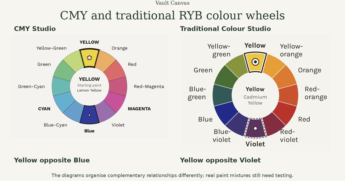
Many painters first learn that red, yellow and blue are the primary colours. Later, they encounter cyan, magenta and yellow—and wonder whether their original colour wheel was wrong. The two sets offer different starting points. Understanding what each describes can help you choose paints, explore colour relationships and make sense of mixtures that behave differently from a diagram. This guide compares CMY with the traditional red–yellow–blue model. “Traditional” here refers to that familiar teaching model, rather than every historical painting practice.
Vault Canvas offers two free, interactive colour-planning tools for painters. CMY Studio explores colour relationships and painting palettes using Lemon Yellow, Primary Magenta and Primary Cyan. Traditional Colour Studio explores the same ideas using Cadmium Yellow, Cadmium Red and Ultramarine Blue. Both are visual planning guides rather than paint simulators, so their screen colours and suggested relationships should be tested with your own paints.
What are CMY and RYB?
CMY stands for cyan, magenta and yellow. It is a modern set of subtractive primaries. RYB stands for red, yellow and blue. It is the historical primary set commonly associated with painters’ colour wheels. The Colour Literacy Project explains that CMY offers a wider theoretical mixing range than traditional RYB. It also makes an essential qualification: no three primaries can produce every colour. A limited palette always has boundaries. Primary colours explained.
| Question | CMY | Traditional RYB |
|---|---|---|
| Starting colours | Cyan, magenta, yellow | Red, yellow, blue |
| Familiar secondary directions | Red, green, blue | Orange, green, violet |
| Useful focus | Exploring a modern subtractive model | Exploring a familiar painters’ wheel |
| Practical limitation | Real paints differ from ideal primaries | Results depend strongly on the particular reds, yellows and blues |
These are the particular starting paints used by the two Studios, not universal definitions of CMY or RYB. Different pigments and brands will produce different mixtures.
Neither model supplies a complete recipe for painting.
Where did RYB, RGB and CMY come from?
No single person invented all three systems. RYB developed over centuries as a practical model for painters using the pigments available to them. It remains familiar in art teaching, although different red, yellow and blue paints produce very different mixing ranges.
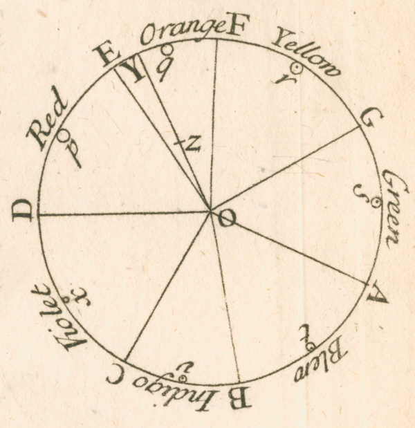
Isaac Newton’s contribution concerned light rather than paint. His prism experiments showed that white light contains a spectrum of colours, and in Opticks (1704) he arranged that spectrum into an influential colour circle. His work helped establish the scientific study of colour, but he did not invent the modern RGB, CMY or RYB systems.
RGB describes coloured light. Screens begin with darkness and add red, green and blue light at different intensities. With no light the screen appears black; combining all three at full intensity produces white.
CMY describes the subtractive behaviour of colourants such as printing inks. Cyan, magenta and yellow inks absorb different parts of the white light falling on paper, leaving the remaining light to be reflected towards the viewer. Commercial printing normally uses CMYK, adding black ink for stronger shadows, sharper detail and more reliable dark tones. Tiny dots of these four inks can reproduce thousands of colours without requiring a separately mixed ink for each one.
How colours are specified
Different colour systems describe colours in different ways. Screen colours can be given RGB values or a six-character hex code, such as #FF0000 for red. Commercial printing may use CMYK percentages or a Pantone reference for a standardised printing colour. Artists’ paints are usually identified by their pigment codes and manufacturers’ colour names. These systems do not translate perfectly: the same colour can look different on a screen, in print and as mixed paint.
These models therefore serve different materials and purposes: RGB for emitted light, CMYK for most commercial colour printing, and RYB as a familiar painters’ model. CMY can also give painters a useful alternative starting point, but real pigments still need physical testing.
Why paint behaves differently from a screen
A screen produces colour with emitted light, usually through red, green and blue components. Paint is seen through light interacting with pigments and the painted surface. In subtractive mixing, colorants absorb parts of the incident light. Combining them changes which light returns to the eye. Real paint also scatters light, and its behaviour depends on the pigments, binder, thickness and surface. This is why a digital colour wheel cannot reliably show the result of stirring two particular paints together. It can help organise relationships, while physical swatches establish what your materials do. The Colour Literacy Project distinguishes RGB light mixing from CMY colorant mixing in its discussion of primaries.
What changes when you use CMY?
In an idealised CMY model:
- Cyan and yellow move towards green.
- Magenta and yellow move towards red.
- Cyan and magenta move towards blue.
The last relationship can feel unfamiliar if you learned to treat blue as an unmixable starting colour.
These directions describe a model. Actual paint mixtures may be warmer, cooler, duller or darker than the diagram suggests. Equal quantities are not a universal recipe: one paint may have far greater tinting strength than another.
CMY can be a useful way to investigate bright secondary mixtures. It does not require you to give up earth colours, premixed greens, additional blues or other paints that serve your work.
Why “red and blue make purple” can disappoint
The names on paint tubes cover a wide range of colours. Different reds and blues do not produce interchangeable mixtures. A red leaning towards orange combined with a blue leaning towards green may produce a muted violet. Other pigment combinations can produce a more vivid result. Winsor & Newton uses colour bias to explain these differences: for brighter mixtures, choose starting colours whose biases lean towards the intended mixed colour. Understanding colour bias. Colour bias is a practical simplification rather than a complete model of pigment mixing. Muted mixtures are useful too. The important question is whether the mixture gives you the colour your painting needs.
Do complementary colours change?
They can, because different wheels organise colours differently. The familiar traditional pairs are red–green, yellow–violet and blue–orange. The National Gallery describes their use in painting, including the contrast they create when placed beside each other. Complementary colours. An idealised CMY/RGB arrangement instead pairs cyan–red, magenta–green and yellow–blue. Compare the CMY wheel and compare the traditional wheel with Yellow selected in each.
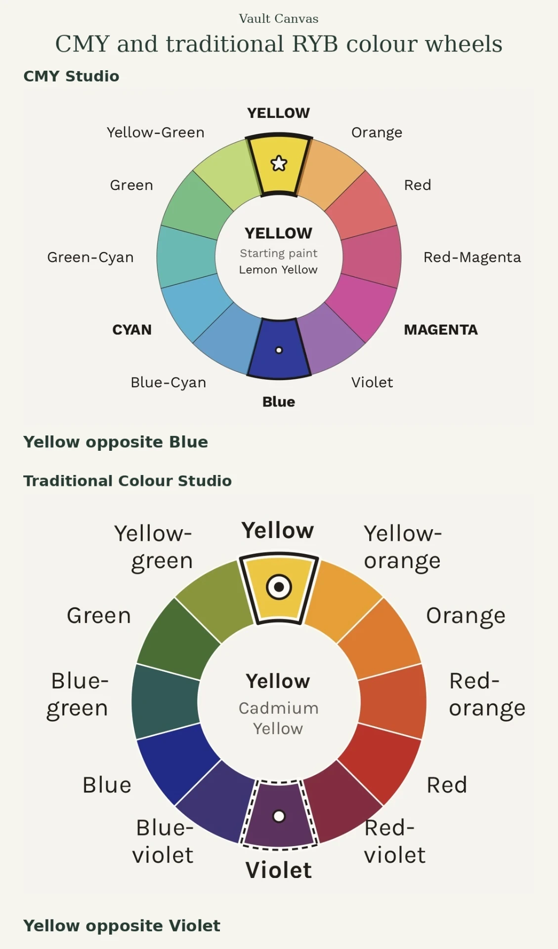
Always identify the wheel you are using. A colour directly opposite another on one diagram may occupy a different position on another. Also distinguish contrast from mixing. Two colours may create a striking contrast side by side without the corresponding paints producing a perfectly neutral mixture. Test your actual pigments when you want a particular grey or muted colour.
How to compare the approaches yourself
Make two small mixing charts with paints you already own. For one, select a cyan-like colour, a magenta-like colour and a yellow. For the other, select the red, yellow and blue you normally use. Label every starting paint with its name and pigment code where available. Mix each pair in several proportions, working gradually from one colour towards the other. Keep your surface and application method consistent, then compare the dry swatches. Look for:
- The brightest greens, oranges and violets each set produces.
- Useful muted mixtures.
- Colours that remain difficult to reach.
- Differences in tinting strength, transparency and handling.
This compares those particular sets of paints. It cannot establish a universal winner between every possible CMY and RYB palette.
Choose a palette for the painting
Use CMY when you want to explore that subtractive starting point. Use a traditional wheel when it helps you plan familiar hue relationships. Expand either palette when another pigment gives you a colour or handling quality you need. Keep value and chroma in the decision too. Value means how light or dark a colour appears; chroma describes how colourful it appears compared with a neutral grey of similar lightness. See The Munsell colour system explained. A hue relationship alone cannot tell you whether two shapes will separate clearly or whether an accent will dominate. For reference-image work, build a painting palette from a photograph, or open the Palette & Value Finder to compare colour selections with greyscale and simplified value views.
The Finder’s CMY/Traditional guidance does not alter extracted colours, simulate pigment outcomes or transfer a palette into the studios. See Finder methods and limitations. The most useful colour model is one you understand well enough to test, question and apply with your own materials.
Colour choices are one part of a painting’s story. Once a work is finished, Vault Canvas helps you keep its images and artwork details together and present only what you choose publicly. Explore Vault Canvas’s artwork workspace.