
How to build a painting palette from a photograph
Turn a reference photograph into a manageable painting palette. Compare light and dark shapes, choose important colours, and test the results with your own paints.
7 min read
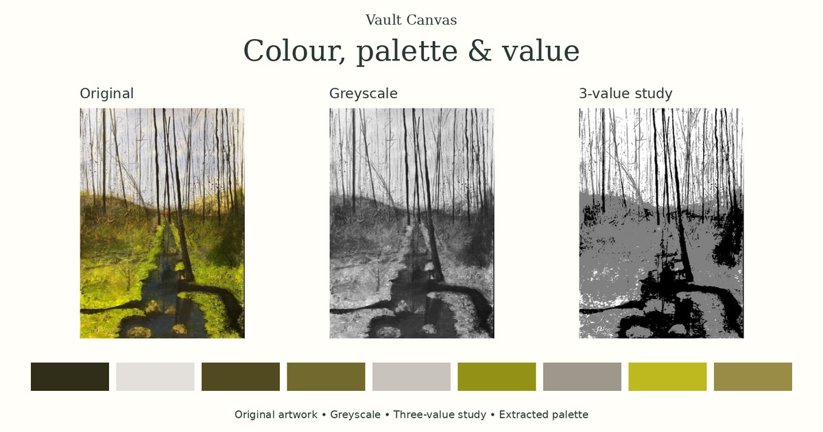
Photographs can contain thousands of subtle colour variations. A painting needs choices: which colours establish its character, where the light and dark shapes sit, and what draws the eye.
This guide takes you through a practical way to make those choices using the free Palette & Value Finder. You will move from an image to a manageable palette, check its tonal structure, then test your decisions with paint.
The aim is to develop a useful interpretation of your reference. You do not need to reproduce every colour the camera recorded.
Start with three questions about colour
When looking at a reference, separate three qualities:
- Hue: the colour family, such as yellow, green or violet.
- Value: how light or dark a colour appears.
- Chroma: how colourful it appears compared with a neutral grey of similar lightness.
These are the three attributes used in the Munsell colour system. Thinking about them separately helps you identify why a mixture feels wrong: it might need to become lighter, duller or a different hue. Munsell system explained.
A colour wheel helps you explore hue relationships. A greyscale view helps you examine light and dark. Both can inform your painting.
1. Choose a reference with a clear purpose
Use your own photograph, your own artwork, or an image you have permission to use.
Before analysing it, decide what interests you. It might be the contrast between a face and its background, a small bright shape in a muted landscape, or the relationship between warm light and cool shadows.
Select the area you intend to paint. A large border or an unrelated section of background can influence an extracted palette without contributing to your composition.
To practise before choosing a photograph, use the Finder’s built-in colourful ape. It is an illustration, not a photograph, but the same comparisons apply.
Remember that you are analysing a photograph. Exposure, lighting, white balance and editing have already affected its colours. If the subject is available, compare the image with what you see directly.
2. Look at the largest light and dark shapes
Greyscale shows an image without its hue, using shades from white to black to help you compare lightness and darkness.
Open the reference in the Finder and compare the original with its greyscale view.
Look for the broad structure:
- Where are the lightest and darkest areas?
- Does the subject separate clearly from its surroundings?
- Are important shapes merging into similar greys?
- Where does the strongest light–dark contrast attract attention?
Two colours can look very different in hue yet become similar in greyscale. That may create a quiet transition, or it may weaken an edge you wanted to emphasise.
Greyscale gives you another way to inspect the image. It does not decide which relationships your painting should preserve.
3. Simplify the image into value groups
The Finder offers three-, five- and nine-band value studies.
Start with five bands to see the main divisions. Switch to three if detail distracts you from the larger shapes. Use nine when you want to inspect more gradual transitions.
The stepped view groups a continuous image into a limited number of lightness bands. This can help you plan a small painted study before committing to a larger work.
In the Finder’s displayed scale, 0 means white and 9 means black. This is its own simplified image-analysis scale. It is not a calibrated Munsell measurement; Munsell value runs in the opposite direction, from 0 = black to 10 = white. Both the direction and range differ.
Use the numbers to compare areas within your reference. Check the actual appearance of your paint separately.
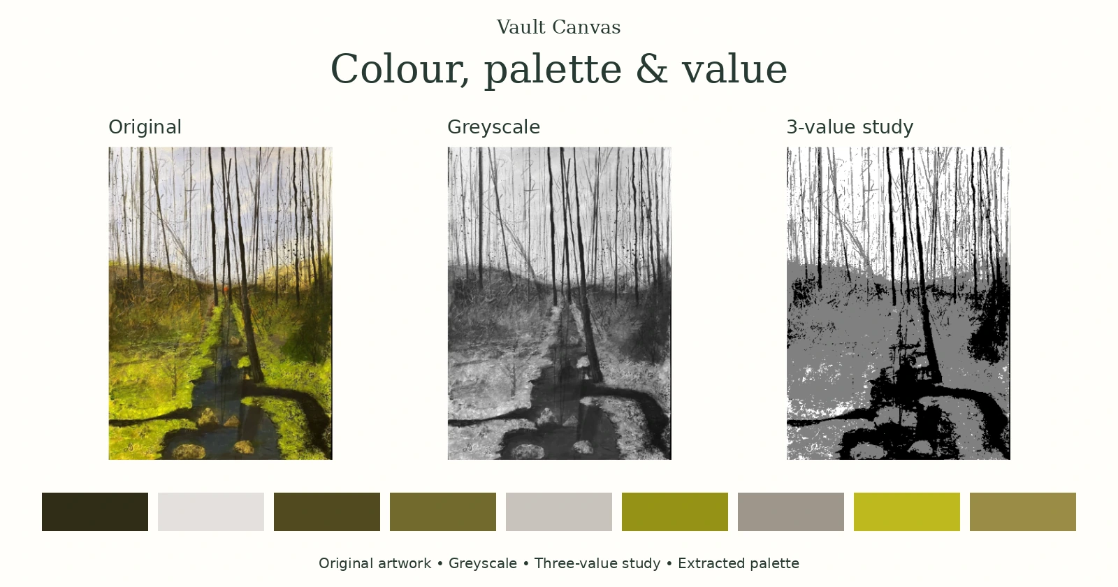
The example below uses a woodland artwork rather than a photograph, but the same comparisons apply. It shows three value bands and nine extracted colours; the five-colour exercise that follows is a simpler starting point.
4. Extract a small starting palette
Begin with five colours as a manageable exercise, then adjust the number if your painting needs it. Five is a starting point, not a proven optimum.
Use Overall palette to investigate the image’s broad colour balance. Try Colour variety when you want to explore a wider selection of colours that might otherwise receive less attention.
Then compare the swatches with the image. Ask what each one contributes:
- Does it represent an important large area?
- Does it help describe the subject?
- Does it provide a useful light or dark?
- Is it a small colour with a strong visual role?
A small accent can matter more to the painting than its area suggests. Use the picker to include a colour you want to retain, and edit or lock swatches as your plan develops.
The extracted palette is a starting selection. Your judgement determines the painting palette.
5. Read the percentages correctly
The Finder’s percentages describe estimated image coverage associated with its extracted colours. They do not describe how much paint to mix.
A swatch covering a large part of the image might represent many related variations. A manually picked or edited colour is labelled accordingly rather than being assigned an invented percentage.
Keep three different kinds of proportion separate:
| Proportion | What it describes |
|---|---|
| Image coverage | How much of the analysed image is represented by an extracted colour group |
| Painting-area proportion | How much of your composition you choose to give a colour or colour family |
| Mixing ratio | The quantities of physical paints combined in a mixture |
You may deliberately change the photograph’s balance. A distracting colour can occupy less space; an important accent can become more prominent.
6. Give the colours a role
Arrange your selected colours around the painting you want to make.
You might choose a dominant colour family, a focal colour and two smaller accents. Vault Canvas’s four-colour painting palette is an adaptation inspired by artist and teacher Robert Burridge’s approach, including the accents he calls “spice colours”.
His suggested 80% dominant, 10% focal and 5% for each accent provides one possible planning exercise. These are approximate painting areas, not paint-mixing quantities. A dominant family can contain several values and variations rather than one flat colour. Robert Burridge’s colour lesson, PDF, printed page 3. Vault Canvas adapts this approach to its twelve-colour wheels; this does not imply Burridge’s endorsement.
Use the proportions flexibly. Your subject may call for a different balance.
Try CMY Studio or Traditional Colour Studio to explore alternative colour relationships. Choose colours deliberately in the Studio; the Finder’s links do not automatically transfer your palette.
7. Test the suggestions with physical paint
The Finder offers CMY and Traditional mixing suggestions. Treat these as directions for experiments with the paints you own.
A screen swatch and its HEX code describe a digital colour. They cannot specify an exact paint mixture. Pigments, transparency, paint thickness, the surface and lighting all affect the result.
Make small labelled swatches. Adjust one thing at a time: hue, lightness or chroma. Allow them to dry before making your final comparison.
If a mixture is duller than expected, consider the particular pigments you combined. Winsor & Newton explains that colours leaning towards the desired mixture can produce brighter results than combinations with conflicting colour biases. Colour bias and mixing. This is a teaching simplification; the result still depends on the actual pigments.
For more context, read CMY and traditional RYB mixing compared.
8. Paint a small study and keep the reference
Make a thumbnail or small painted study using your chosen colours and a few clear value groups.
Check whether the subject reads, whether the focal area attracts attention, and whether the dominant colour family holds the composition together. Change the palette if the study suggests a better solution.
Save the complete reference as a PNG or PDF to keep the image views, swatches and suggested combinations together. You can also download the greyscale image and selected value study separately.
Exports reflect the current selected area and the reduced analysis image, whose longest edge is at most 720 pixels. A larger reference sheet does not restore the full-resolution original.
Keep your physical mixing tests alongside the digital reference. Together they record what you intended and what your materials actually produced.
When the study becomes a finished painting, its images and details need a home too. Vault Canvas keeps an artwork’s images, medium, dimensions and reference together, with certificates and a public portfolio drawn from the same record. See how artwork records work.
For the next stage, see what to record for a finished artwork.
Methods and limitations
The Finder analyses the supplied image in your browser. Its palette, coverage estimates and value views describe that image rather than measuring the original subject or identifying its pigments.
Its simplified values are not calibrated Munsell readings, and its mixing suggestions do not predict exact physical mixtures. Read how the Palette & Value Finder works for the calculations, limitations and sources.
Begin with one reference, five palette colours and five value bands. Make a small study, then let what happens with paint guide your next decision.