
How to Photograph Artwork
A practical, plain-English guide to photographing your own artwork for websites, portfolios, online sales, open-call submissions, prints, social media and archive records.
17 min read
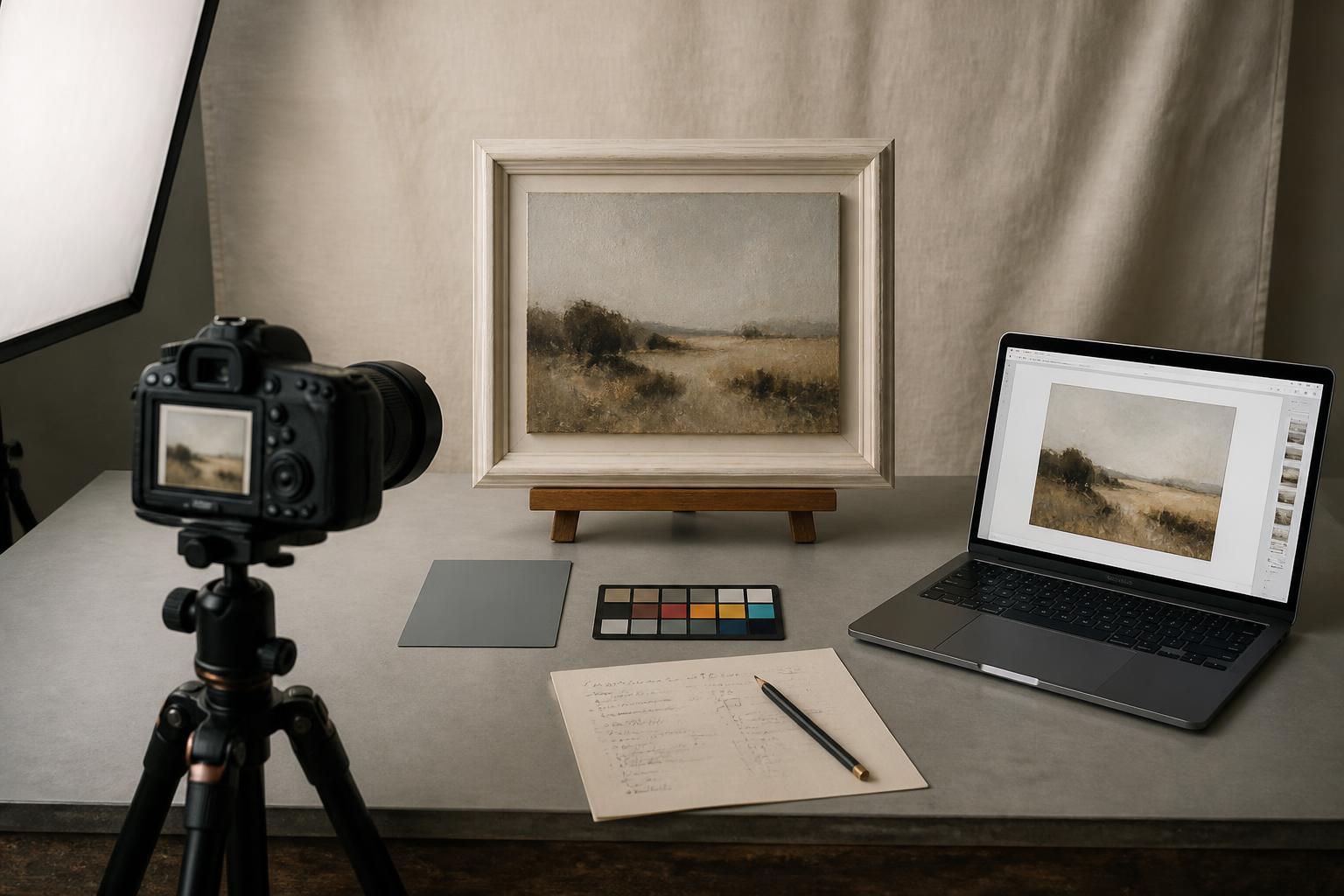
Artists need reliable photographs of their work for almost everything that happens outside the studio. A single painting can end up on a website, in a portfolio, attached to an open-call submission, printed in publicity for a show, reproduced as a giclée print, used on a certificate of authenticity, posted on social media and saved into the artwork record that the artist will rely on for years. Poor photographs can quietly make good work look weak in every one of those places.
The most common problems are familiar: glare across a varnished surface, distortion from shooting at an angle, a yellow or blue cast from the wrong light, files too small for print, shadows from the artist standing in front of their own work, and edges accidentally cropped off. None of these need expensive equipment to fix. The goal of this guide is not to turn artists into professional photographers. It is to help you produce accurate, consistent, trustworthy images of your own work, with whatever camera or phone you already own.
This is a practical guide to how to photograph artwork, written for practising visual artists working with paintings, drawings, prints, works on paper, framed pieces and textured surfaces. The best way to photograph artwork is rarely about a single hero shot; it is about producing a small, consistent set of images that work across different uses. Most artworks need more than one type of image, and the artists whose work looks strong online and in submissions are usually the ones who treat photography as part of finishing the piece.
Why artwork photography matters
When a collector cannot stand in front of the work, the photograph is the work. If the colour is wrong, the scale is unclear or the surface looks flat, the artwork loses something before the price is even discussed.
Open-call juries and selectors often judge entirely from photographs. A panel reviewing several hundred submissions in an afternoon will not give the benefit of the doubt to a blurred or distorted image. The same applies to gallery submissions, art fair applications and residency panels. Strong work has been left out of shows because the images did not do it justice, and weaker work has been selected because the photographs were clean, even and well presented.
Galleries and venues need professional files for publicity, and a low-resolution social crop will not stand up to a printed feature. Artist websites rely on consistent, accurate artwork images more than on any single design choice; a portfolio of well-photographed work looks coherent even on a simple template.
Poor images also distort colour, texture, scale and finish in ways that affect long-term records. Photographs become part of the artwork archive — used for valuations, insurance, condition report comparisons, edition records, certificates and provenance. A photograph taken badly today is a record that lives in the file for the rest of the work's life. The supporting guides on How to Sell Artwork Online, Artist Portfolio Examples, How to Prepare Artwork for an Exhibition and How Certificates of Authenticity Work for Original Artwork all assume usable artwork images already exist.
Decide what the photograph is for
Before setting anything up, decide what each photograph needs to do. Almost every artwork ends up needing several images, and the requirements are not the same.
Typical artwork images include:
- a full website product image, square-on and colour-accurate
- a portfolio image for a website or PDF
- an open-call submission image, usually unframed and on a neutral background
- a gallery or publicity image at high resolution
- a print reproduction image, where colour and detail accuracy matter most
- a certificate or archive image stored against the work's record
- a social media crop, often square or vertical
- one or more detail images showing texture, surface or signature
- a framed image showing the work as it would be displayed
- a scale or room mockup image
Print reproduction needs the highest accuracy. Social media needs strong crops more than absolute fidelity. Submissions usually need clean, neutral, full-work images with nothing distracting at the edges. Archive records benefit most from consistency: the same lighting, the same camera position and the same file naming, used the same way for every work.
You do not have to capture every variant in one session, but it helps to know which uses each artwork will have before you start.
Set up the artwork before photographing it
Photograph clean, dry, finished work. Surface dust, fingerprints on glazing, last-minute varnish or fresh fixings all show up under direct light, often much more than they do to the naked eye.
Before the camera comes out:
- hang the work flat on a wall or place it upright on a stable easel
- make sure the artwork is level and square to the wall
- remove clutter from the background and the floor in front of the work
- clean glass, frames, mounts and visible edges
- check for dust, fingerprints and stray threads
- flatten or secure works on paper carefully
- leave a generous border of empty space around the artwork for cropping
- never photograph wet varnish, unstable fixings or warped paper
A plain wall, a sheet of mid-grey board, or a clean white wall away from windows works better than a busy studio shot.
Lighting: how to photograph artwork without glare
Lighting does more for artwork photography than any camera upgrade. The aim is even, diffused light across the whole surface, with no bright reflections, no strong shadows and no colour cast.
The easiest options are a large north-facing window with the room lights off, two matched daylight-balanced LED panels or softboxes placed one on each side of the work, or a covered outdoor space on an overcast day away from coloured walls.
Whichever you use, the same rules apply:
- avoid direct sunlight, which creates hot spots and harsh shadows
- avoid mixed light sources, which create competing colour casts
- with two lights, place them at roughly 45 degrees to the work, at the same height and distance on each side
- if glare appears, move the lights wider, higher or further back rather than moving the camera
- avoid the on-camera flash, which almost always creates a central hot spot
Artwork under glass, varnish or glossy surfaces
Reflections on glass and varnish are rarely the camera; they are the room bouncing back. To control them:
- light from a steep angle on each side, so reflections bounce away from the lens
- darken the area in front of the work — wear dark clothing, hang a dark cloth behind the camera
- for artwork under glass, work in a darker room with side lighting only
- where it is safe, photograph the work out of its frame for the master image, then capture the framed version separately
A polarising filter is an optional advanced step. Used on the lens and combined with polarising sheets on the lights, it can almost eliminate glare on glass and varnish; for most artists, a careful angle and a dark room in front of the work do most of the same job for free. The same approach answers how to take pictures of art without glare, how to photograph artwork with glass and how to photograph artwork under glass: control the room first, the camera second.
Camera or phone: what do artists really need?
A modern phone is good enough for website images, social media, archive records and most admin uses, as long as it is used carefully. A DSLR or mirrorless camera is better for very large reproductions, professional print files and high-resolution submissions, where every pixel of the artwork will be examined.
Whichever you use:
- use the main rear lens — not the ultra-wide, which distorts edges
- avoid digital zoom; step back or step forward instead
- clean the lens before each session
- shoot at the highest available resolution and quality setting
- use a tripod or stable support and a self-timer or remote shutter
- keep the camera square to the artwork, with the lens centred on the work
- avoid heavy filters and any automatic "beauty", AI or scene enhancement modes
If you are photographing artwork with a phone, the best way to photograph artwork with an iPhone or any modern phone is to lock focus and exposure on the work itself (tap and hold on the artwork in the camera app), turn off automatic HDR effects that brighten shadows artificially, and stick to the standard 1× lens. A small tripod with a phone adapter, or even a stack of books against a stable wall, is enough to keep the shot sharp.
Camera position and perspective
Keep the camera parallel to the surface of the artwork. The lens should sit at the centre of the work, with the camera body level. Even a small tilt produces keystone distortion, where the top and bottom of the work taper inwards or outwards.
Use the gridlines in your camera or phone app. Line a horizontal grid line up with the top or bottom edge of the work, and a vertical grid line up with one of the sides. If any pair of edges is not parallel, the camera is slightly off square.
Step back a little further than you think you need to and let the artwork fill most, but not all, of the frame. A small border of clean wall makes cropping straight much easier. Avoid digital zoom — move the camera, not the zoom slider. After editing, the artwork itself should still look rectangular; if it does not, the camera was not square to the work.
How to photograph paintings, prints, paper and framed work
The principles above stay the same across surfaces, but a few adjustments help:
- Canvas and panel paintings. Keep the camera square, leave space for the edges if they are part of the work, and use even side lighting. For heavily textured pieces, take both a flat-on image and a slightly raked-light image to show the surface.
- Works on paper, drawings and watercolours. Lay flat where possible, watch for buckling, and check graphite or charcoal for hot spots.
- Art prints. Photograph the full print flat and clean. For a limited edition, capture the edition number, signature and any embossing as separate detail shots in the same file set. See Limited Edition Prints for the wider documentation conventions.
- Framed artwork and work under glass. Clean the glass thoroughly, light from the sides, and darken the area in front of the camera to control reflections. Where possible, keep both a framed and an unframed image.
- Large artwork. Use more space, keep the lens centred and avoid wide-angle distortion. Where possible, photograph in sections and stitch them together rather than backing far enough away to lose detail.
- Textured or glossy work. Take a flat full image plus separate detail images in raking light, so the texture reads honestly without misrepresenting overall colour.
The same underlying approach — even light, square camera, full image plus details where needed — covers how to photograph a painting, how to photograph canvas paintings, how to photograph art prints, how to photograph large artwork and how to photograph framed art.
Colour accuracy and basic editing
Colour accuracy starts in the camera, not in editing. Set the white balance to match your light source — daylight for window light, or a custom white balance using a grey card or a clean sheet of white paper held in front of the work. Most phones allow manual white balance in their pro or RAW modes.
Avoid colour casts from the room. A green carpet, a coloured wall or a wooden floor lit by the window will all bounce light onto the artwork. Where possible, work in a neutral space, or hide strong colours with a white or grey board.
Once you have the file:
- crop tightly to the edges of the work
- straighten carefully, using the artwork's own edges as the guide
- adjust exposure and contrast gently
- correct any remaining colour cast against the real artwork in neutral light
- avoid over-saturation
- do not remove texture, brush marks or surface flaws in a way that misrepresents the work
- save both the original camera file and the edited master separately
Compare the edited image to the real artwork side by side under neutral light. The photograph should look like the artwork, not better than it. Honest images build trust; buyers who feel a work matched their expectation come back.
Detail shots, framed shots and scale images
A single full image is rarely enough. For each work, consider capturing:
- a full artwork image, square-on, on a neutral background
- one or more close-up detail images showing texture or brushwork
- a signature or edition detail image
- an edge or side image showing depth, for canvas or panel work
- a framed image, where the framing is part of how the work will be shown
- a scale image — the work on a wall in a real interior, or a simple room mockup
Buyers trust multiple views. A detail shot tells a collector what the surface looks like; a scale image helps them imagine the work on their own wall. Keep these images linked to the same artwork in your records rather than scattered across folders. The guides on How to Sell Artwork Online and Artwork Management for Artists: A Complete Guide describe how those image sets feed into wider sales and record processes.
File sizes, formats and naming
A single artwork usually generates several files. A simple, repeatable set is:
- a master file straight from the camera, untouched
- an edited master at full resolution, used as the source for everything else
- a high-quality web file, around 2000–3000 pixels on the longest side
- a square or vertical social crop
- a smaller submission file sized to each open call
- a print reproduction file at the size and resolution the printer asks for
JPEG is fine for web, social and most submissions. TIFF or a maximum-quality JPEG suits the master and print files. Do not keep only social-media-compressed versions of your work; once an image has been heavily compressed by a platform, the original quality cannot be recovered.
Use a consistent file naming convention. A useful pattern is:
{artist-surname}-{artwork-title}-{year}-{image-type}.jpg
For example:
bowers-standing-ground-2026-full.jpgbowers-standing-ground-2026-detail-01.jpgbowers-standing-ground-2026-framed.jpgbowers-standing-ground-2026-web.jpgbowers-standing-ground-2026-social.jpg
Add alt text for every image used on a website — a short, plain description of what the image shows, including the artist's name and the artwork title where appropriate.
Keep image assets connected to the artwork itself, not scattered across phone albums, desktop folders and social posts. Vault Canvas is designed so the full image, details, social crops, certificate scans and archive records all live against the same artwork. For the wider record system, see Artwork Archive: How to Create a Digital Archive, Database and Record System for Your Artwork, Artwork Management for Artists: A Complete Guide and Copyright for Artists.
Common mistakes when photographing artwork
The most common mistakes are easy to spot once you know what to look for:
- photographing the work at an angle, so the artwork looks tapered
- uneven lighting, brighter on one side than the other
- visible glare or hot spots on varnish or glass
- shadows from the artist or camera falling across the work
- colour casts from coloured walls, carpets or mixed light
- low-resolution files that fall apart at any printed size
- dirty lenses leaving soft patches in the image
- cluttered backgrounds that distract from the work
- edges accidentally cropped off
- wide-angle distortion that bends straight edges
- over-editing that hides texture or oversaturates colour
- inconsistent filenames that break the link between image and artwork
- keeping only Instagram-sized files, with no master version
- using a screenshot of a website image instead of the original file
- failing to photograph the reverse, frame or detail when it would have been useful
Reviewing a small batch of recent artwork images against this list, and re-shooting the ones that fail, is usually enough to lift an entire portfolio.
Artwork photography checklist {#artwork-photography-checklist}
A short checklist to run through for every shoot:
- artwork is clean, dry and stable
- wall, easel or surface is level and uncluttered
- background is neutral and free of distractions
- camera or phone lens is clean
- camera is parallel and square to the artwork
- lens is centred on the work
- light is even on both sides, with no hot spots
- no glare, harsh shadows or reflections of the room
- highest resolution and quality settings selected
- tripod and timer or remote shutter in use
- a full artwork image is captured
- detail images are captured where the surface or signature matters
- a framed or scale image is captured if it will be useful
- colour is checked against the real artwork in neutral light
- the original camera file and the edited master are both saved
- web and social versions are exported from the master
- files are named consistently, with artist, title, year and type
- images are linked back to the artwork record
A repeatable exhibition checklist for photography sits naturally alongside the wider artwork checklists in your artwork inventory.